Most ecommerce stores measure the success of their list building tactics by one number: how many people subscribed. That’s understandable, but it’s the wrong metric. A list full of people who subscribed for a discount and never bought anything is a cost, not an asset.
List quality is what drives revenue. And list quality is determined almost entirely by how you collect subscribers in the first place. The popup you use, when it appears, what it says, and what happens after someone subscribes — all of it shapes who ends up on your list and whether they ever buy.
In this article, we’ll share 11 tactics (plus a pro tip) that help you build a list of people who actually want to hear from you, and buy from you.
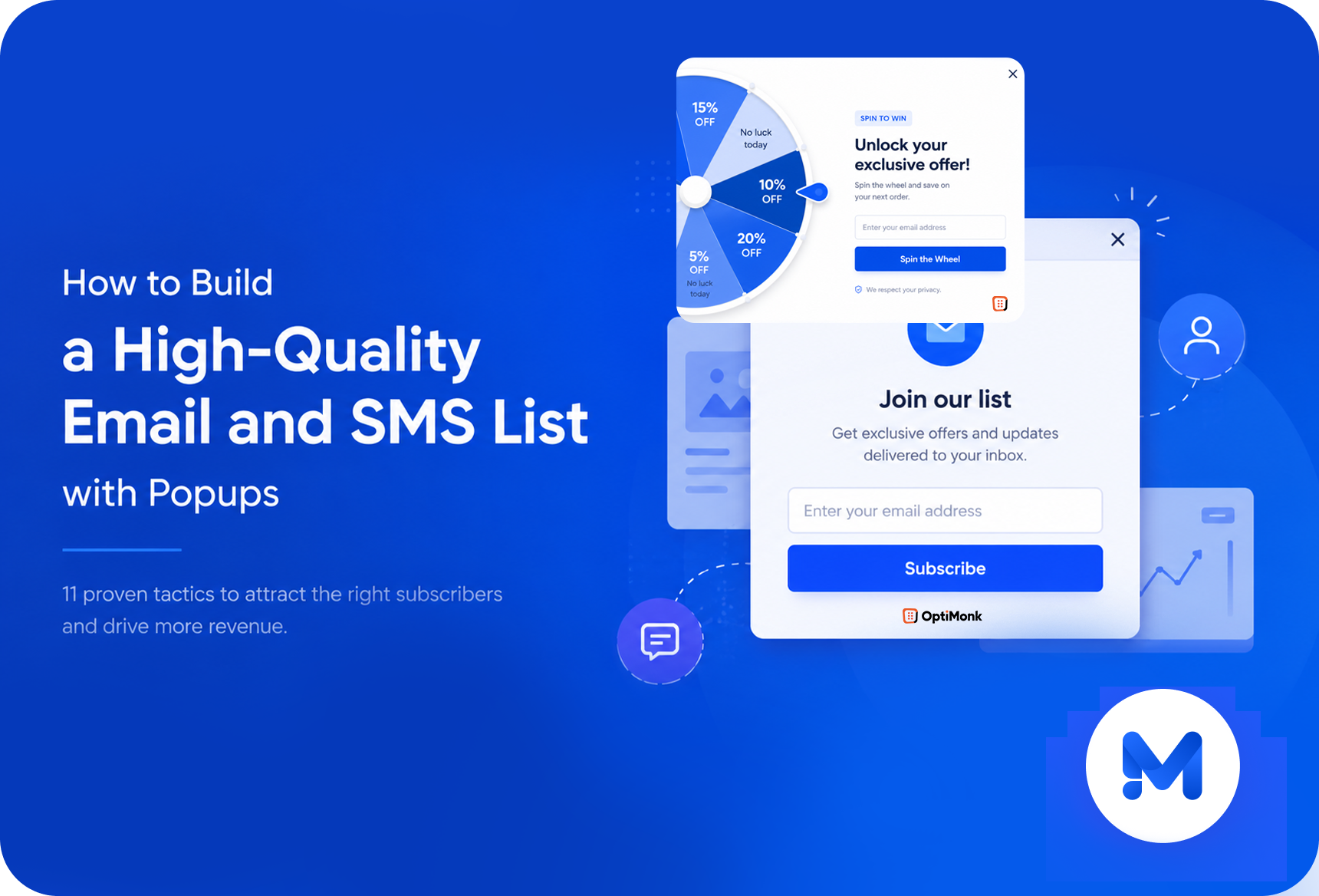
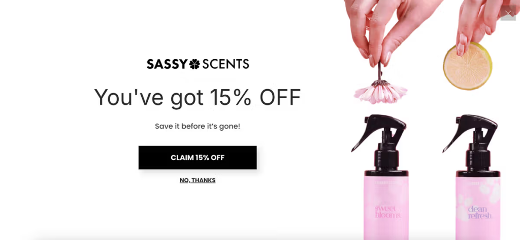
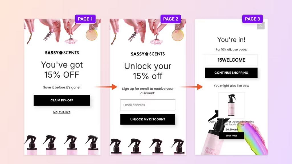
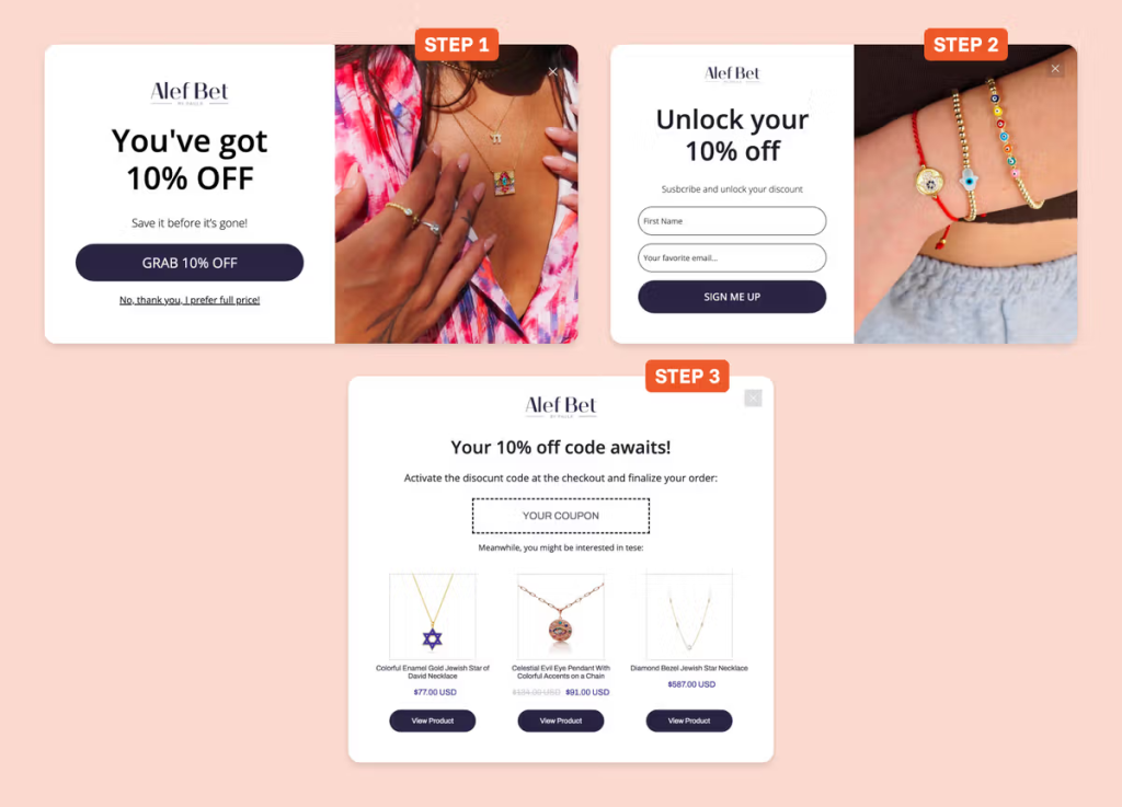
Tip #1: Start with a multi-step popup
Single-step popups (one box, one email field, one button) have a built-in problem: they ask for a commitment before they’ve given the visitor any reason to say yes.
Multi-step popups flip that sequence.
The first step is a simple question. No email required. Just a low-stakes choice:
“Want 15% off your first order?” with a Yes and No button.
This works because of a well-documented principle called the foot-in-the-door effect: people who make a small commitment (even just clicking a button) are significantly more likely to follow through on the next step. They’ve already said yes once. Now asking for an email feels like a natural continuation, not a demand.
Mott & Bow’s “Want to pay $26 less for our jeans?” approach is a great example of this.

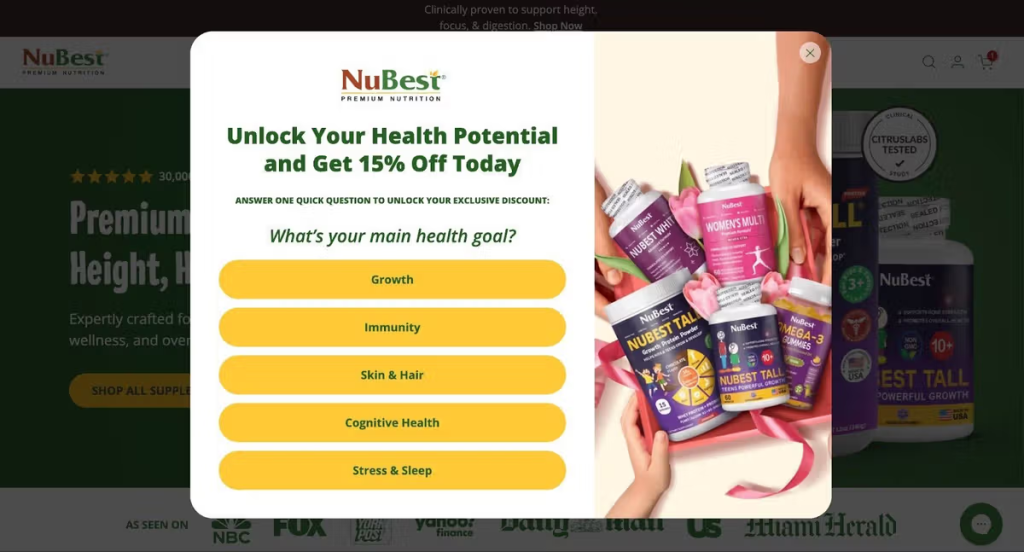
The other version of this is the segmentation question: “What are you shopping for today?” with answer choices like Men’s / Women’s / Gifts.
The subscriber gets a more relevant offer, and you get a pre-segmented list from day one.
NuBest used a “What’s your main health goal?” segmentation to deliver personalized offers by customer type.
Tip #2: Trigger on exit intent
Exit intent triggers are one of the most effective popup timings available, but how you configure them matters a lot.
The important nuance: only show the exit popup if the visitor has spent at least 10 seconds on the page and hasn’t already added something to their cart. Someone who’s been browsing for 10+ seconds without buying is genuinely on the fence. That’s who you want on your list.
Someone who’s already carted a product is a different situation. They need a cart abandonment sequence, not a generic welcome offer.
This condition-setting alone improves your list quality.
Tip #3: Use a fullscreen popup
Fullscreen popups take over the entire viewport. For most situations, that’s too aggressive. But for your primary welcome offer or a major promotion, it’s worth considering.
The reason is simple: distraction is the enemy of conversion. When someone is reading your popup copy and can still see the product grid behind it, their attention is split. A fullscreen popup eliminates that. The offer is all there is. Nothing to look at, nowhere to click except forward or out.
Fullscreen formats also give you room to actually design something — a real visual, proper typography, brand-consistent layout. The quality of the experience signals the quality of the brand.
Tip #4: Optimize for mobile
Somewhere between 60% and 70% of ecommerce traffic is now on mobile, and still, most popups were clearly designed by someone looking at a desktop monitor.
Tiny text, fields too small to tap accurately, a close button that requires a steady hand. That’s friction, and friction means fewer subscribers.
Mobile-first popup design means:
- Large tap targets for buttons
- A single-column layout
- Short copy
- A close button that’s actually easy to hit
Choose a popup builder that lets you edit the mobile and desktop views independently. What works on a 1440px screen is almost never right for a 390px screen.
Tip #5: Add trust-building elements
The moment a popup appears, the visitor’s default reaction is skepticism.
You’re asking for their contact information. What are you going to do with it? How often will you email them? Is this worth it?
Social proof answers these questions before the visitor has to ask. A subscriber count (“Join 47,000+ customers”), a few star ratings pulled from your review platform, a media logo from a publication that’s featured you, or even a simple “No spam. Unsubscribe anytime.” badge — all of these reduce friction at the exact moment it matters most.
Tip #6: Delay the close button by 2–3 seconds
When a popup appears, a large percentage of visitors will close it before reading a single word.
It’s a reflex. The same one that makes you skip YouTube ads the instant the button appears.
The popup triggers an automatic dismissal response, and the offer never gets evaluated.
Delaying the X button by 2–3 seconds breaks that reflex loop. The visitor can’t immediately close it, so they read instead. If the offer is relevant to them, they’ll subscribe. If it’s not, they’ll close it 3 seconds later, but they’ll have made a conscious decision rather than a knee-jerk one.
The key phrase is 2–3 seconds. Anything longer will frustrate visitors. The goal is a considered decision, not a trapped one.
Tip #7: Offer a unique, single-use discount code
“WELCOME10” is not a discount strategy. It’s a discount that anyone can find by Googling your brand name plus “coupon code.”
But more importantly, it creates zero urgency. The visitor knows the code will work next month just as well as today.
A unique, single-use code changes the dynamic entirely. Each subscriber gets a code generated specifically for them. It can’t be shared, it can’t be found online, and it expires.
The perceived value is higher because the code is actually personal, and the urgency is real because once they close the tab, the offer is gone.
From a list quality perspective, unique codes also give you better conversion tracking. You can tie each code back to a specific subscriber and measure who actually used it, which tells you a lot about the quality of your activation sequence.
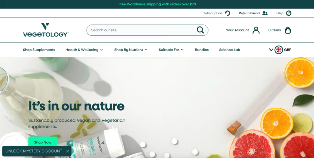
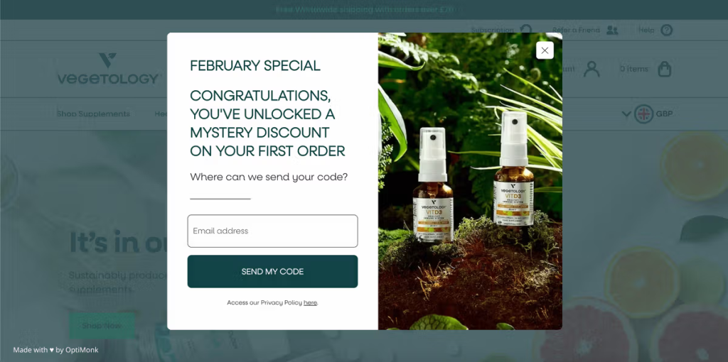
Tip #8: Add a sticky teaser
A sticky teaser is a small tab that stays visible as the visitor browses your site, either before the popup has appeared or after they’ve closed it.
Before the popup, the teaser plants the offer in the visitor’s mind without interrupting them. They see “10% off waiting for you” while they browse, and by the time the popup appears, they’ve already been primed for it.
After the popup is closed, the teaser gives them a second chance. Maybe they weren’t ready to subscribe when the popup appeared, but 30 seconds later — after seeing a product they liked — they are. The teaser keeps the offer accessible without being intrusive.
See below how Vegetology used a sticky teaser to achieve a 13.8% signup rate.
Tip #9: Recommend products on the thank you page
The thank you screen is one of the most underused surfaces for popups.
The visitor just took an action. Their attention is at its peak. And you’ve just built a small amount of trust by confirming their subscription.
Use that moment. Show them 2–3 product recommendations based on what they were browsing, or your current bestsellers if you don’t have that data. If you asked a segmentation question in the first step, this is a great way to use that data and show something relevant.
Many stores see first purchases happen directly from the thank you page because the timing is right.
Tip #10: Auto-redeem discount codes
Getting someone to subscribe is step one. Getting them to actually use the discount code is step two, and it’s where a lot of stores lose revenue they think they’ve captured.
The standard flow: subscriber gets a code, copies it, goes to browse, forgets what it was, gets to checkout, can’t remember it, abandons. It happens constantly.
Auto-redemption removes that friction. When the subscriber clicks through from the popup or the thank you page, the code is automatically applied to their cart. They don’t have to remember it, find it, or type it. The discount is just there, waiting for them at checkout.
The downstream benefit: you can now measure popup ROI with accuracy. Each code ties to a subscriber. Each code redemption ties to a purchase. You have a clear conversion path from signup to sale.
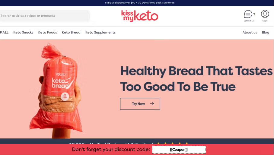
Tip #11: Add a discount reminder campaign
People often get distracted, switch devices, close tabs, and simply forget about their discounts.
A sticky bar reminder keeps the offer visible as they continue to browse your site. Instead of waiting for them to check their email, the reminder meets them where they already are — on your website — with a simple message: your code is still waiting, and here’s what it’s worth.
This closes the loop between the signup and the first purchase. Email captures a subscriber. The reminder converts them into a buyer.
Pro tip: Your email popup is one tool, not the whole strategy
A new visitor who hasn’t subscribed should see your email popup. That’s the right audience for it.
But once someone has subscribed — or if they’re a returning visitor who didn’t subscribe the first time — showing them the same welcome popup again is a wasted impression.
You need to segment visitors by behavior. Gelpro, a collagen brand, is a perfect example of this. They ran three parallel popup campaigns based on visitor behavior.
Returning visitors saw a browsing reminder highlighting products they had viewed during their last visit.
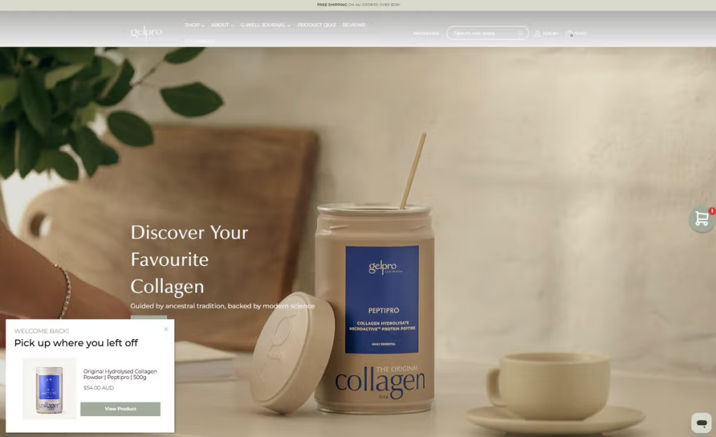
Cart abandoners received a cart reminder showing the items they left behind.
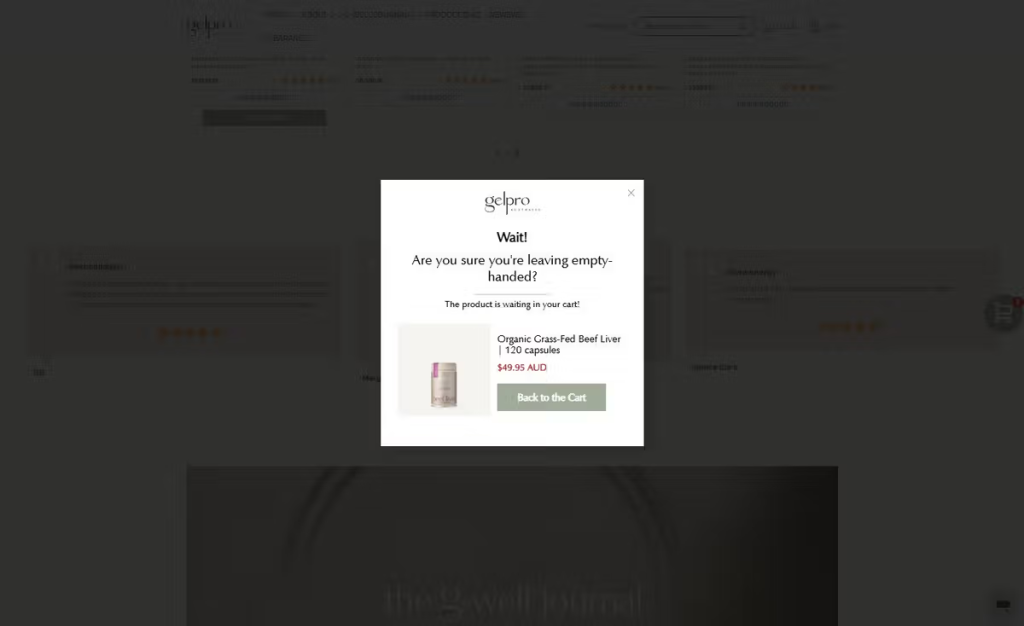
Visitors spending a long time on a product page saw a product recommendation popup.
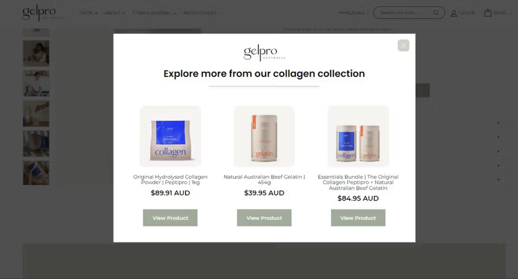
The welcome popup is an acquisition tool. The others are conversion tools. Using only the first one means you’re only doing half the work.
FAQ
What is a popup?
A popup is an overlay that appears on top of a webpage to capture a visitor’s attention at a specific moment — when they arrive, when they’re about to leave, after a set amount of time, or when they reach a certain point on the page. On ecommerce sites, popups are most commonly used to collect email and SMS subscribers in exchange for a discount or offer.
What makes a high-quality email list?
A high-quality email list is one where a meaningful percentage of subscribers open, click, and buy — not just a large number of addresses. The three signals that indicate list quality are open rate, click-through rate, and revenue per subscriber. A list of 5,000 engaged subscribers who regularly purchase is more valuable than a list of 50,000 people who ignore every email. List quality is built at the point of acquisition: who you collect, how you collect them, and what you offer them in exchange for signing up.
What is the best time to show a popup to collect email subscribers?
Exit intent, combined with a minimum time-on-site condition (at least 10 seconds), consistently outperforms other triggers for list quality. The visitor has shown real interest by browsing, but hasn’t bought yet — that’s the highest-intent window for a subscription offer. Immediate on-load popups tend to collect more subscribers, but with lower purchase intent.
What is a multi-step popup and why does it work?
A multi-step popup separates the subscription flow into two steps: first a simple yes/no question or a segmentation choice, then the email field. The first step requires no commitment, just a click. This works because of the foot-in-the-door effect: people who say yes to a small ask are significantly more likely to complete the next step. Conversion rates on multi-step popups are consistently higher than single-step formats.
How do I optimize a popup for mobile?
Use a single-column layout, large tap targets for buttons and the close icon, and short copy that doesn’t require scrolling. The most common mobile popup mistake is designing on desktop and assuming it scales down cleanly. It doesn’t. Use a popup builder that lets you edit mobile and desktop views independently.
Wrapping up
List size is a vanity metric. A list of 10,000 disengaged subscribers is worth less than 2,000 people who consistently open, click, and buy. The difference is built at the moment of acquisition — the popup, the offer, the timing, the flow that follows.
These tactics work together. A multi-step popup with a segmentation question, triggered on exit intent after 10 seconds, with social proof, a unique discount code, auto-redemption, and a sticky teaser reminder — that’s a complete acquisition system, not a popup. Each layer adds a little more intent, a little more trust, a little more reason to subscribe seriously instead of casually.
You can build all of this without a developer. If you want to see how it works, try OptiMonk free.